
Designing a Healthcare Scheduling Experience with OOUX
THE CHALLENGE
Making Scheduling Easy
A healthcare system wanted to redesign their mobile appointment scheduling experience, which on the surface seemed straightforward. Users needed a way to schedule appointments with providers at different locations. But with a fast timeline and limited resources, they needed a plan of attack that helped set them up for long-term success.
I co-facilitated a UX strategy workshop with the full product team—over 15 people including development leads, product owners, executive directors, data specialists, developers, and contractors— prior to design and development.
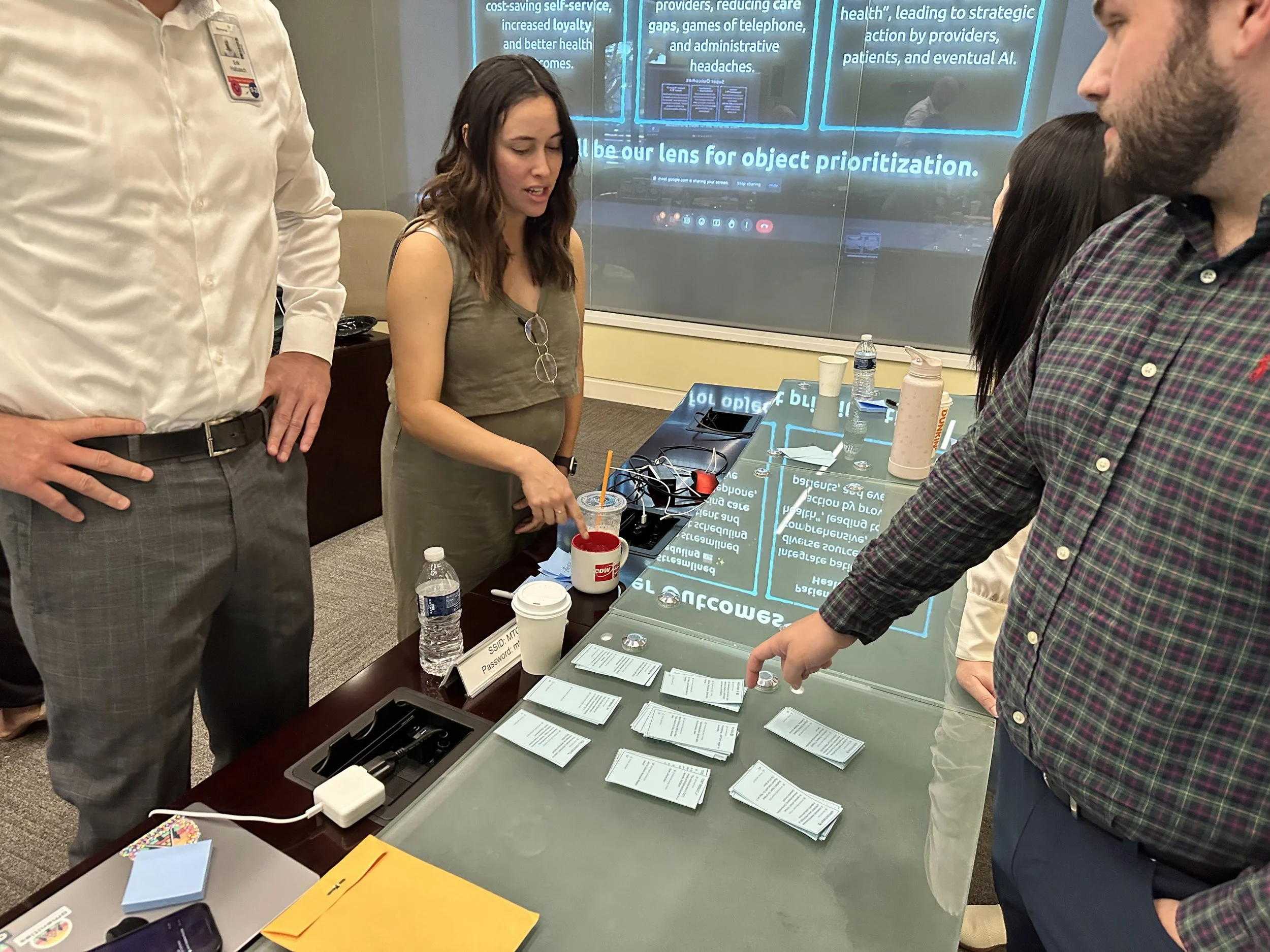
Workshop participants pointing at blue notecards arranged on table during collaborative OOUX workshop session.
Mapping the System Together
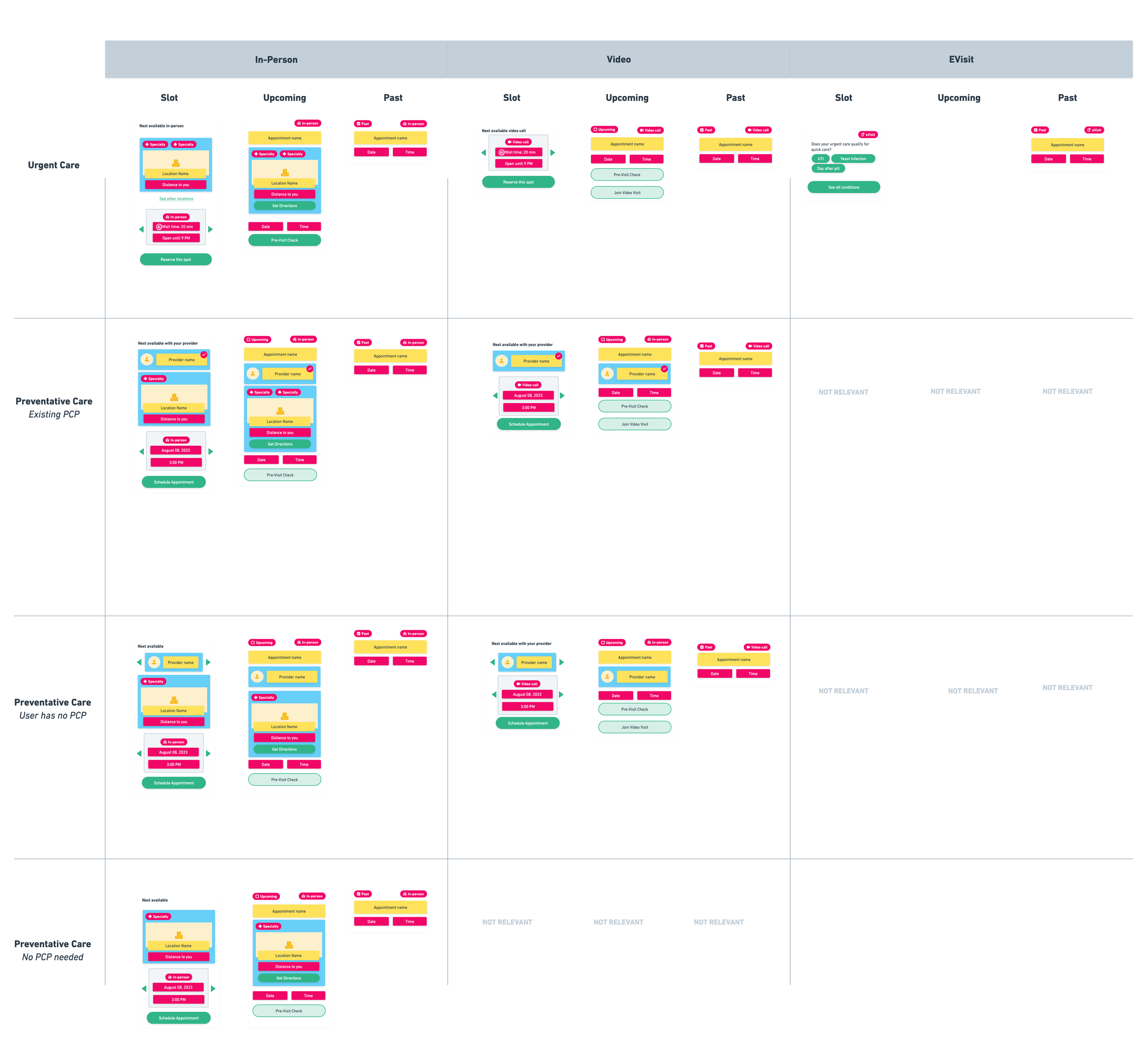
The workshop started by narrowing down to the core objects of the feature—things like User, Location, Provider, and Appointment. But it was the “Appointment” object that ended up having a lot of hidden assumptions and complicated requirements making it the focus of those three days.
By the end, everyone left that room understanding not just what we were building, but why the system needed to work this way. We had in depth discussions that got everyone aligned on all the variations of an “Appointment” based on different states and stages it went through.
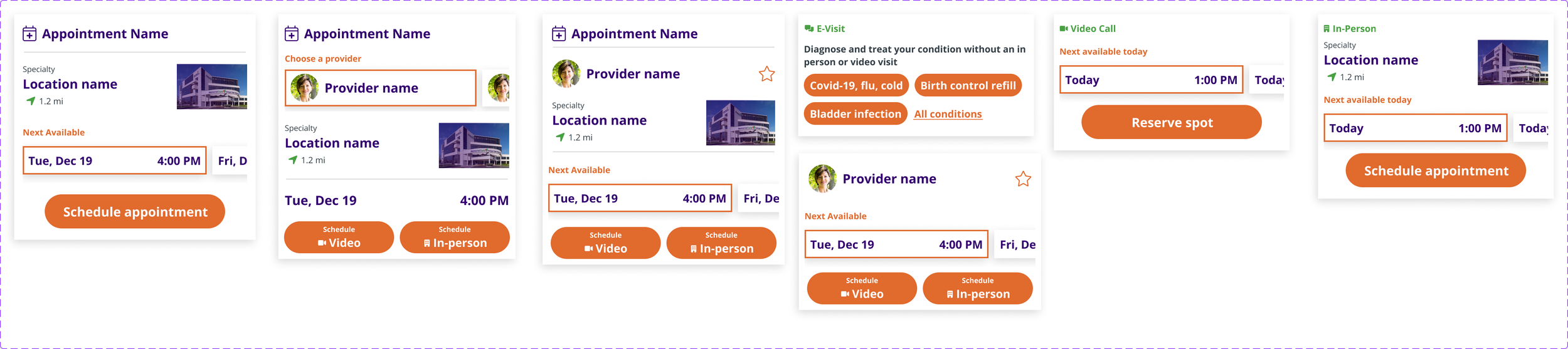
Appointment card design matrix showing variations across four card types, multiple states, and five location contexts using OOUX style-sketching.
Designing With Complete Context
When it came time to design the screens, I had everything necessary to create a robust, reusable Appointment card component, and the development team had the foundational understanding for why an “upcoming appointment” looked different from a “past appointment”, which looked different from an “available appointment slot”. All because we met and got aligned together from the start.

In the end, the product team had clear designs to create the front-end experience from, and there were little back-and-forth revisions as their teams developed the experience.
No daily review calls to discuss forgotten edge cases. No scrambling to update mockups because a new requirement popped up three weeks into development.
What this meant for the project:
Long-term plan and alignment, improving future discussions.
Better user experience (appointments were clearly recognizable no matter their state)
Faster design and development phases without endless back-and-forth
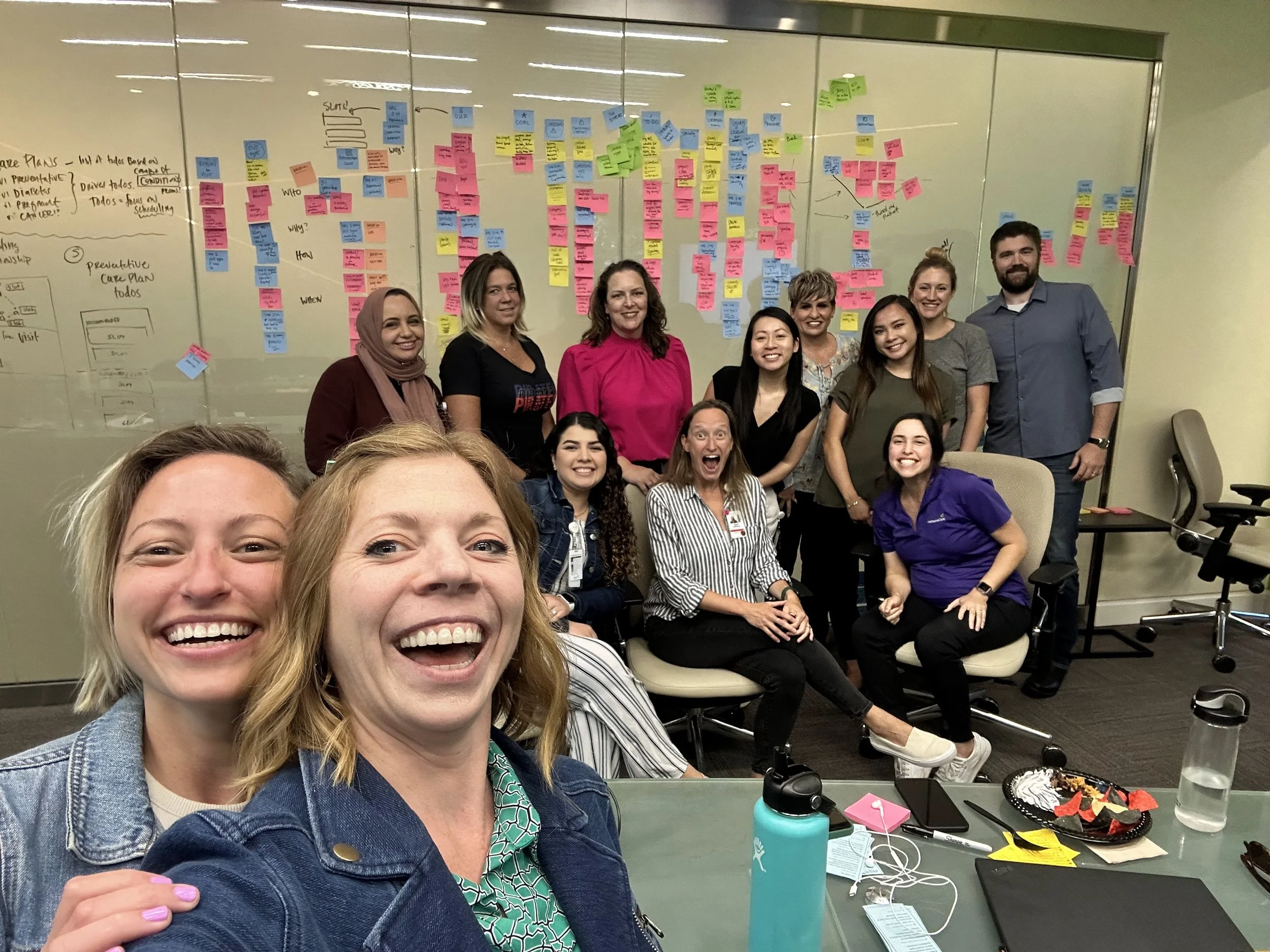
OOUX facilitators Allie Ofisher and Sophia Prater with some of the workshop participants in front of the completed object map at the end of a three-day ORCA Sprint.

Why OOUX ?
Learn why I’ve integrated OOUX and the ORCA process into my work supporting clients and teams.