

EARLY-STAGE SAAS
When the Vision Existed but the Product Didn't Yet
A university donor tool with a slim budget and no existing product to reference. Went from vague idea to a prioritized MVP backlog in days.

THE CHALLENGE
Strategic Design Within Budget Constraints
A University philanthropic department had a clear vision for a new tool to help find and match donors more easily. But because the tool didn't exist yet, they didn't have an understanding of how it would function, or what data they'd need access to.
Budgets were slim, and they needed a proof of concept to attract more investment. That meant we couldn't design everything. We needed a focused approach that could be built efficiently with little additional design support down the line.
Without a clear picture of the system, we risked designing too little—creating generic components that couldn't handle the complexity—or designing too much and blowing the budget before we could ship.
Breaking Down the System
Before any screen design, I led a multi-day object-oriented discovery sprint—a structured discovery workshop based on Object-Oriented UX, a method for designing systems around the real-world objects users interact with. The workshops brought together the organization's director, their development team, and a UI designer.
By breaking the system down into its core objects, we moved from vague vision to detailed requirements in just a few days.
The primary purpose of the tool was to let someone select nodes—what we defined as Entities, like people, organizations, or funds—and view the Connections between them, like family, professional, or charitable relationships.
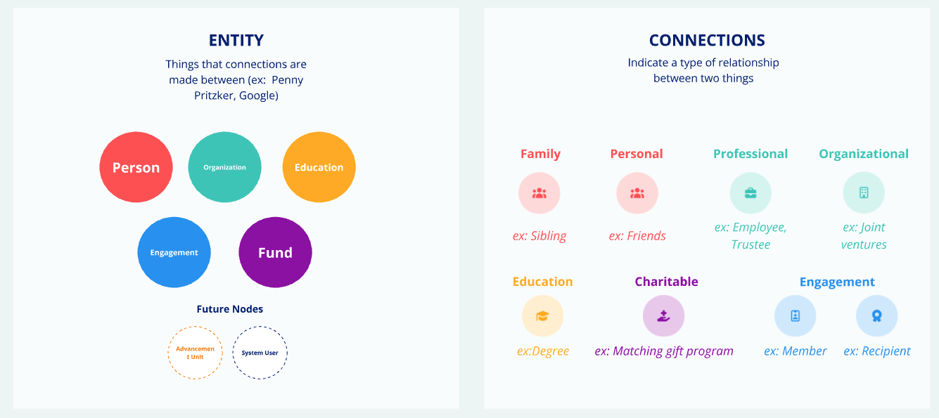
Together we built a rough visual map of the system's front-end experience using digital sticky notes. We defined how Entities and Connections were built differently based on their type, and got clear on what was in and out of scope. That clarity helped leadership prioritize the MVP and build a backlog they could hand directly to their development team.
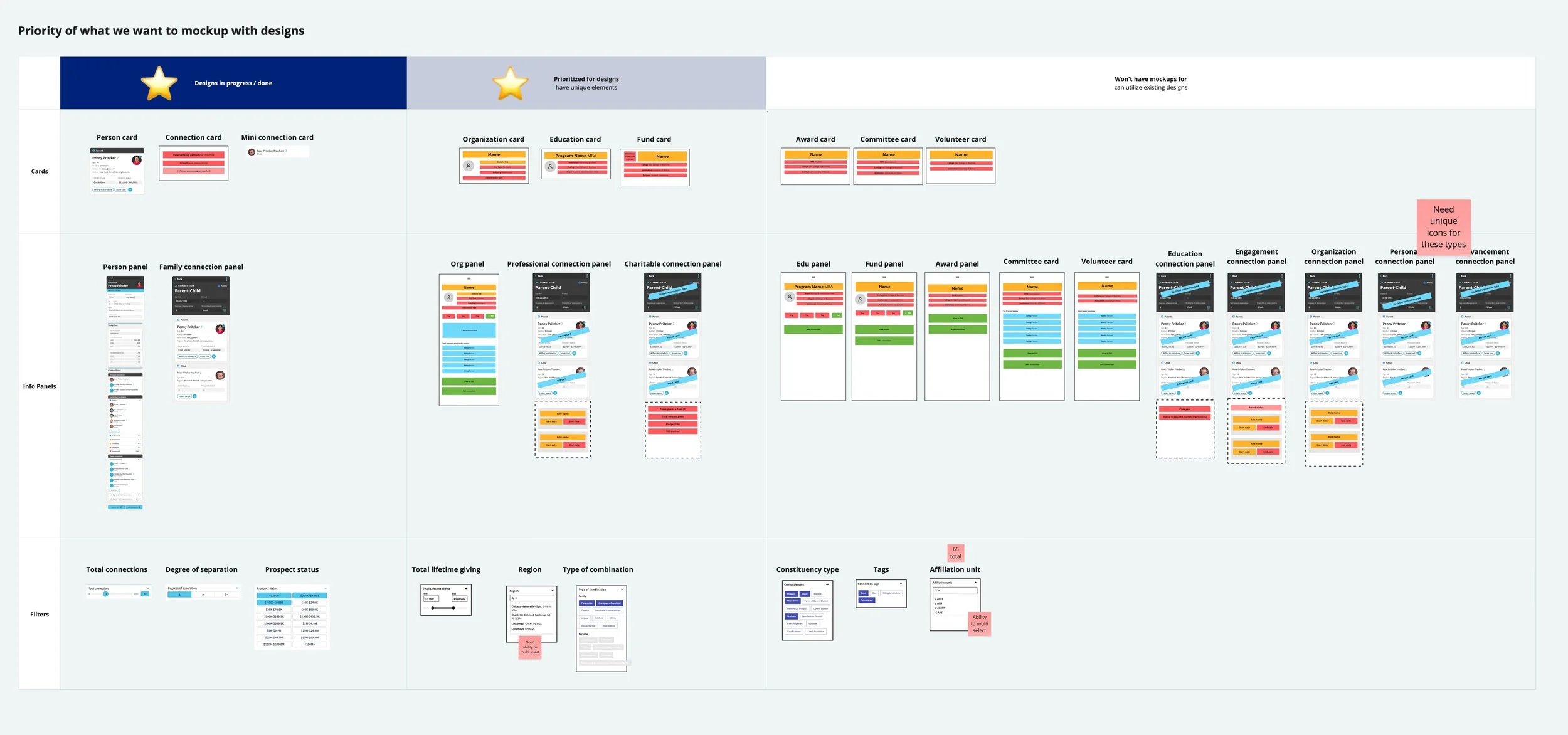
The outcome of a multi-day remote object-oriented workshop
Designing for Recognition, Not Just Function
With a limited budget, we had to be selective about which screens we designed. Without the early alignment from our workshop, the easy path would have been to design one generic "Entity card" and one generic "Connection card" and call it done.
That approach feels efficient at first—just reuse the same design. But it's exactly the kind of decision that makes products harder to use. When everything looks the same, users have to work harder to tell things apart, adding mental effort and frustration to every interaction.
When you're bringing something to market for beta testing, the last thing you want is unnecessary confusion getting in the way of real feedback.
Because we understood how Entities and Connections differed from one another, we made intentional design choices so each type was easy to recognize at a glance—without designing more than the budget allowed.
What this meant for the project:
A prioritized backlog leadership could hand directly to their development team
A lean design approach that held up during beta testing
Faster design and development phases without endless back-and-forth
Building something complex on a limited budget?
The right strategic foundation upfront can save you from costly revisions down the line. If you're ready to build something that works from day one, I'd love to talk.

Curious about the method itself?
Learn why Object-Oriented UX is the foundation behind every project I take on.