
THE CHALLENGE
Making Scheduling Easy
A healthcare system aimed to design its mobile appointment scheduling so users could book appointments with providers across various locations. With a tight timeline, they sought a clear plan for long-term success.
To get there, I co-facilitated a UX strategy workshop using Object-Oriented UX—a method for designing systems around the real-world objects users interact with. The workshop brought together over 15 team members, including development leads, product owners, executive directors, data specialists, developers, and contractors, creating shared understanding across every role before a single screen was designed.
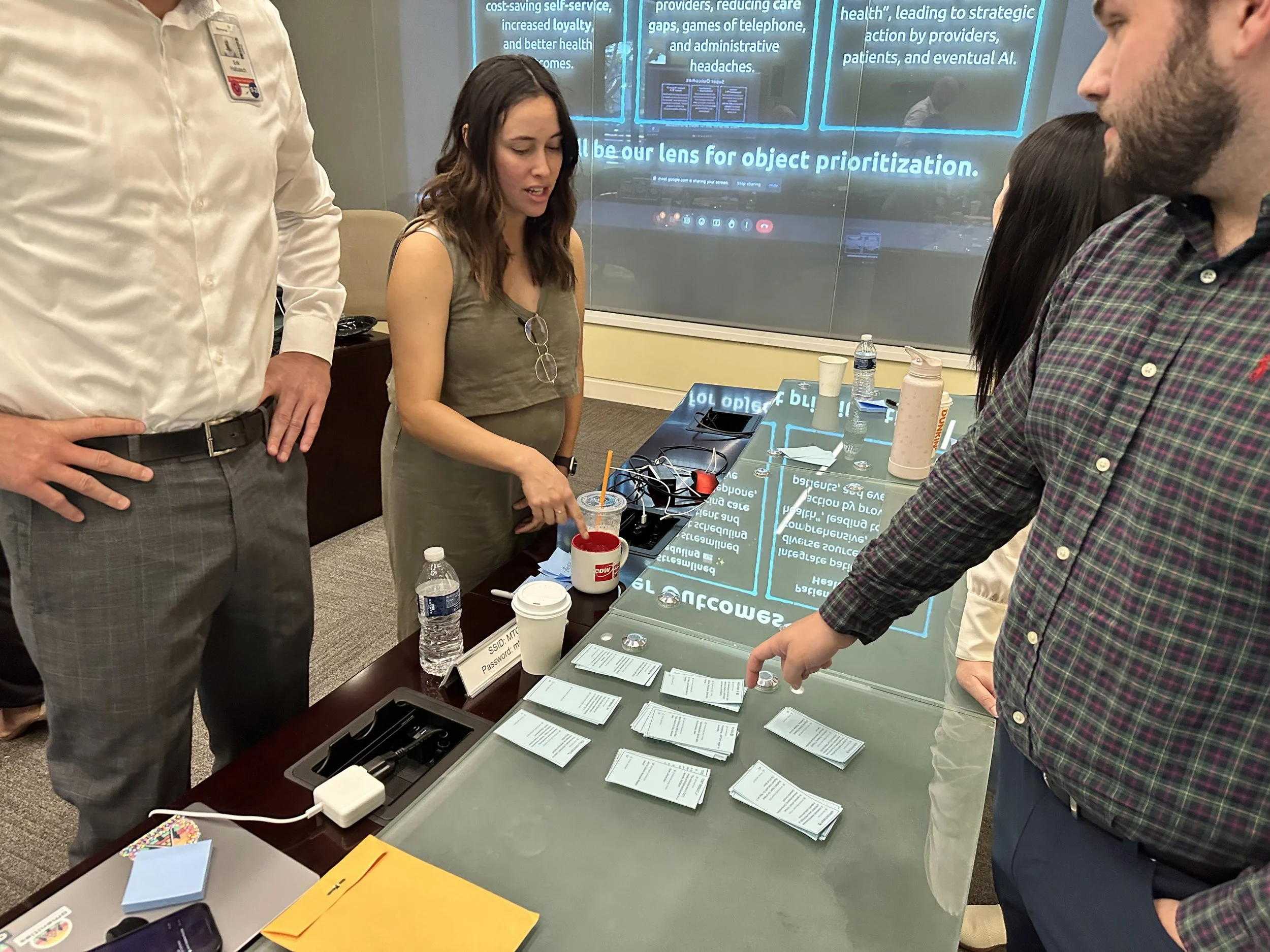
Workshop participants point at blue notecards arranged on a table during a collaborative OOUX session.
Mapping the System Together
With such a diverse group in the room, the workshop surfaced assumptions and requirements that would have otherwise emerged as costly surprises mid-development. Together, we identified the core objects of the system: User, Location, Provider, and Appointment. The Appointment object quickly revealed hidden complexity—different states, different stages, different contexts—and became the focus of our three-day effort.
By the end, everyone understood not just what we were building, but why the system needed this design. That shared language became the foundation for everything that followed.
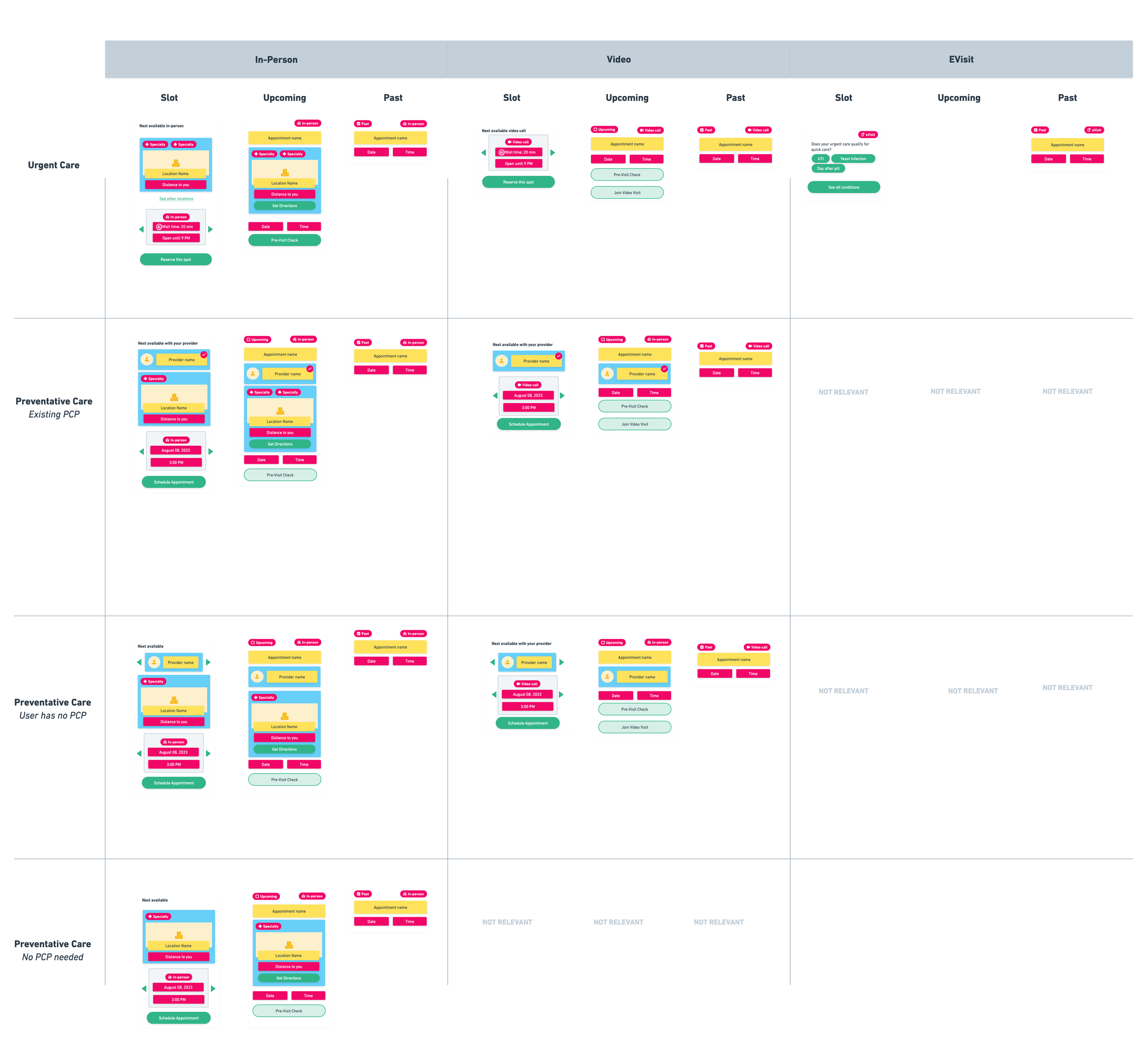
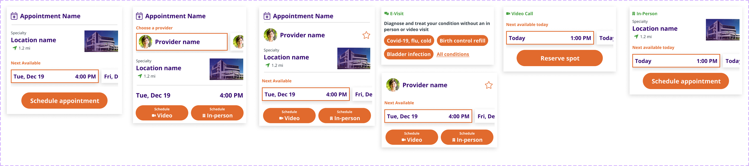
Appointment card design matrix showing variations across four card types, multiple states, and five location contexts using OOUX style-sketching.
Designing With Complete Context
Going into the design phase with that foundation made all the difference. As the designer, I had everything I needed to create a strong, reusable Appointment card component that accounted for every variation from the start. The development team understood why an "upcoming appointment" looked different from a "past appointment" or an "available appointment slot," because they'd been part of defining those distinctions from day one.
That early alignment translated directly into a smoother build: fewer revision cycles, no daily check-in calls to address forgotten edge cases, and no last-minute mockup updates due to requirements surfacing weeks into development.
What this meant for the project:
Long-term plan and alignment, improving future discussions.
Better user experience—appointments were clearly recognizable no matter their state
Faster design and development phases without endless back-and-forth
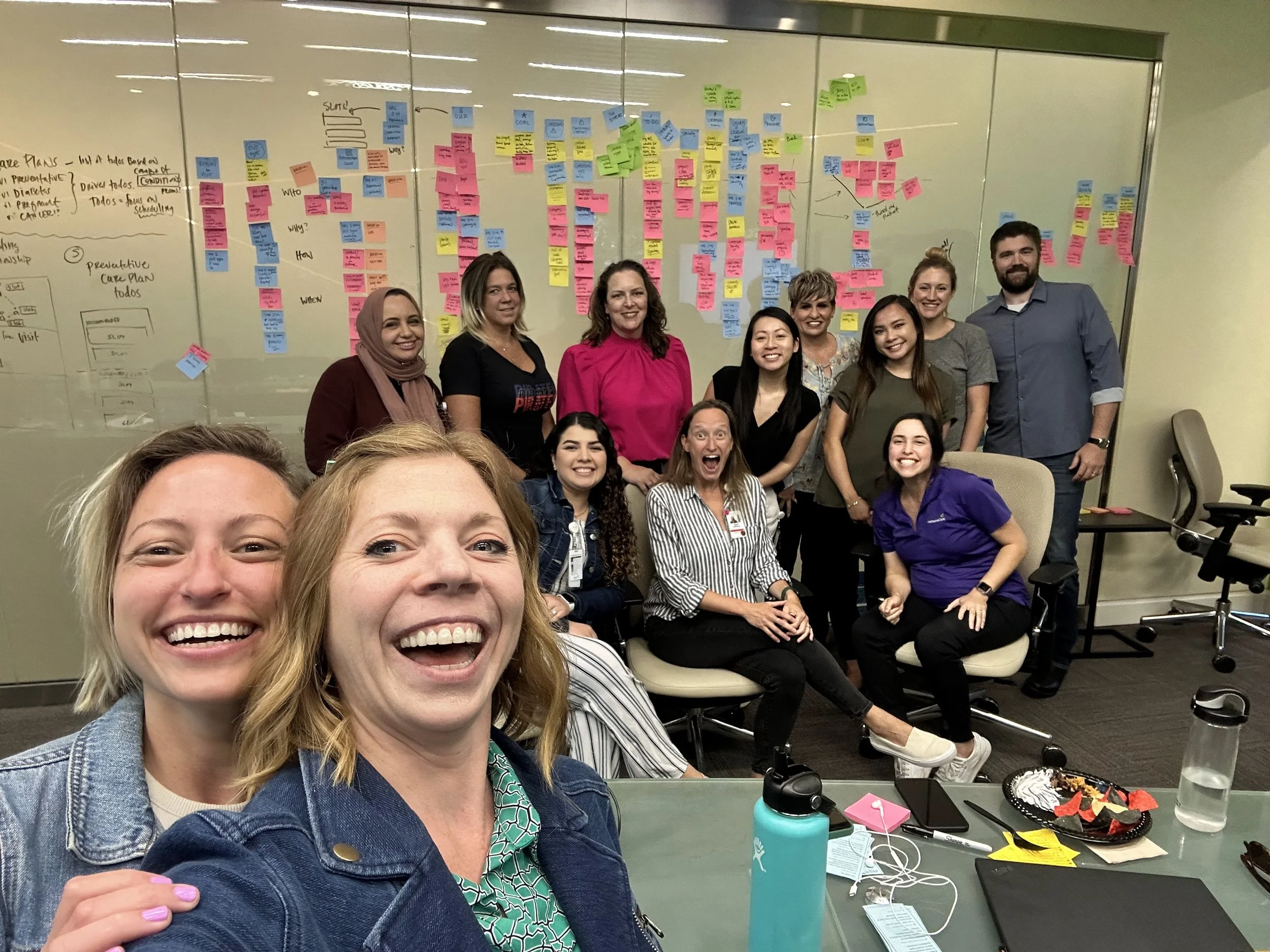
OOUX facilitators Allie Ofisher and Sophia Prater with some workshop participants in front of the completed object map at the end of a three-day ORCA Sprint.